
Mealmo
Meal Prepping, Made Easy.
UI/UX Case Study
Summary
Mealmo is a meal prepping and rewards application for university students. The application helps students save time by accommodating features that allow users to explore recipes efficiently while staying on track with their meal prepping schedules for student rewards. Mealmo also consists of a community where students can post recipes online and gain inspiration from others.
Role
Research, Ideation, UI/UX, Prototyping, Branding, Design, Motion Graphics, Illustration
Tools
Figma, Illustrator, InDesign, Adobe After Effects, Photoshop
Duration
Jan - Mar
3 Months
2021
Team
Jamie Kwong
Katie Tran, Paolo Michele, Jun Lai
Problem
Students of higher education are developing improper eating habits. Due to time constraints and distractions, university students are meeting below the recommended daily food intake. Students may lack cooking knowledge since they are moving away from home and they may lack the motivation to stick to a strict eating schedule.

Design Challenge
How can we design a product that will be convenient for students while keeping them on track when it comes to meal prepping schedules?
Solution
A mobile application platform that incentivizes meal prepping and builds a community of cooking enthusiasts. Mealmo keeps students on track with their meal prepping schedule by incorporating rewards from completing tasks and meal preparation. Students can also use the meal prepping calendar to add meal plans while gaining inspiration from the community to save recipes and try out. Below is a promotional piece on Mealmo for new users.
Animated by Janet He & Paolo Michele
Illustrations by Janet He, Jamie Kwong, Katie Tran, & Paolo Michele


Onboarding
A smooth onboarding experience, used to get to know the user's preferences and tastes better. Mandatory for first-time users who want to connect to their educational institutions.
Inspirational Feed
Explore page features new and trending recipes in the community. Users can also post recipes and follow friends to check out their recipes for inspiration.
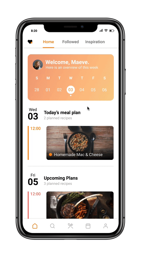

Stay on Track
A meal calendar fully customizable to the user’s schedule. Users can add recipes to specific dates and times for their meal plans with the option to set notifications and alarms to stay on track.
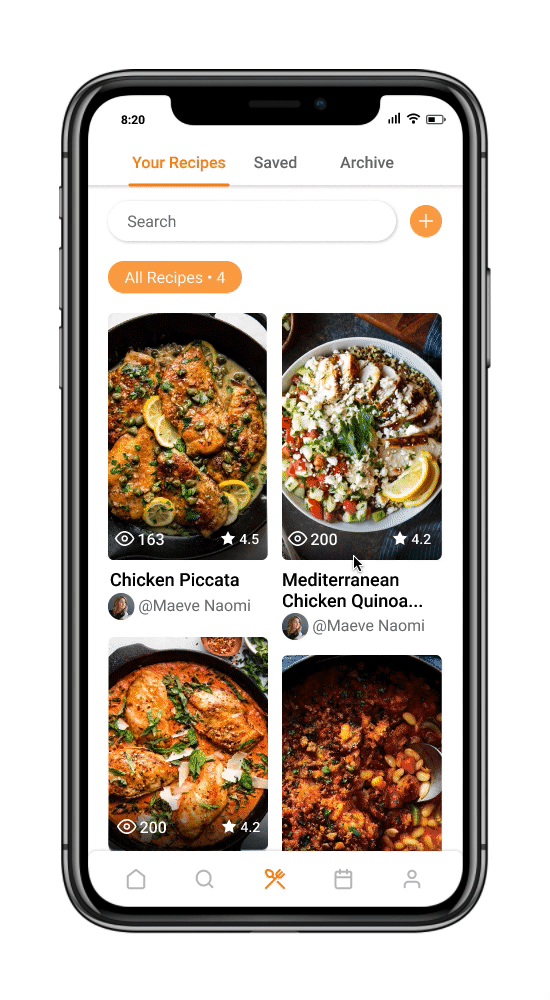
Save & Create Recipes
Explore and share recipes, while creating your own. Save delicious recipes while personalizing them to your dietary preferences.

Profile & Student Rewards
Partnership with an educational institution to offer relevant and appealing incentives to students. Institutions can offer discounts at their local bookstores to help students save money on textbooks. Users can also see their posts and edit their account preferences through their profile.
PROCESS
Competitive Analysis
We started off by investigating existing applications that involve meal preparation. Competitors included BigOven and Mealime. The pain points we’ve learned involved bugs, premium subscriptions, and recipes overpopulating the recipe pages. BigOven’s user interface was messy and was hard to navigate for users while Mealime’s interface was easy to navigate and was organized. After as a group, we created a PACT analysis, user personals, & user scenarios.


Understanding our Audience
The primary audience for our mobile application are higher education students. Our approach involved creating user personas and user scenarios. We also conducted user interviews to gain insights into the perspective of the students.


Ideating the Application
As a group, we brainstormed the system requirements and features we will need for our application. We then created a chart and included indications of priority standings, requirements, rationales, and the system function. Before heading towards the design stage, we established a system map and user flows for the application.


DESIGN PROCESS
Visual Design & Branding
While building the architecture of the application, we also started with building our brand. This includes the color palette, typography, and brand values. We wanted a color scheme that would be appropriate for our target audients. We went with a light orange since the color invokes a more inspirational and motivational mood. As for the interface, we wanted a clean and modern feel, going along with SF Pro rounded as the typeface.

Low & Mid Fidelity
After establishing the visual guideline, branding, and color pallet, we sketched out the layouts and created black, grey, and white screens on Figma to create layouts.


High Fidelity & User Flows
Mealmo is broken down into five main sections, home, explore page, recipe, calendar, and profile. Here are the breakdowns for the user flows of the final screens.


After designing the high fidelity prototype, we finalized the prototype after the user testing. Throughout the user testing, we gave 4 participants 13 tasks when given the prototype (based off the user personas we made). Most of the user testing went smoothly but we have discovered some bugs, suggestions, and insights from the feedback.
User Testing
Motion Graphic & Illustrations
The illustrations showed up in some buttons and the motion graphic promotion video. The process for the motion graphic began with creating and sketching out mood boards. After the screens are established, we went ahead as a team to create consistent illustrations. Paolo and I were in charge of creating the motion graphic. My role was to animate the illustrations and logos, while Paolo took charge of the interface animations and sound syncing.


REFLECTION
Reflection
Mealmo was an extremely fun project to work on. Coming together as a team as food enthusiasts created a fun and cheerful atmosphere as we all worked on the project together. I found that working on projects as a team to be very fun and mind-opening as everyone came up with a pocket full of ideas. Everyone came from different backgrounds, and we leveraged everyone’s strengths!
Throughout the process of designing Mealmo, I’ve discovered that interviews and user testing can be extremely useful. As we went forward with the interviews, its great getting insights from people’s experiences and pain points from different applications. This allows us to avoid the same mistakes other applications had as we design and ideate our application. User testing is a must when it comes to ensuring that the final prototype goes smooth sailing without any broken links. It is also important to create an application where users can pick up the interface quickly.
Overall, the teamwork was phenomenal, and I had a wonderful time designing Mealmo. My favorite part of the project would be animating the motion graphic with a team member! Watching the project come together was definitely satisfying, and everyone learned a lot throughout the phases.